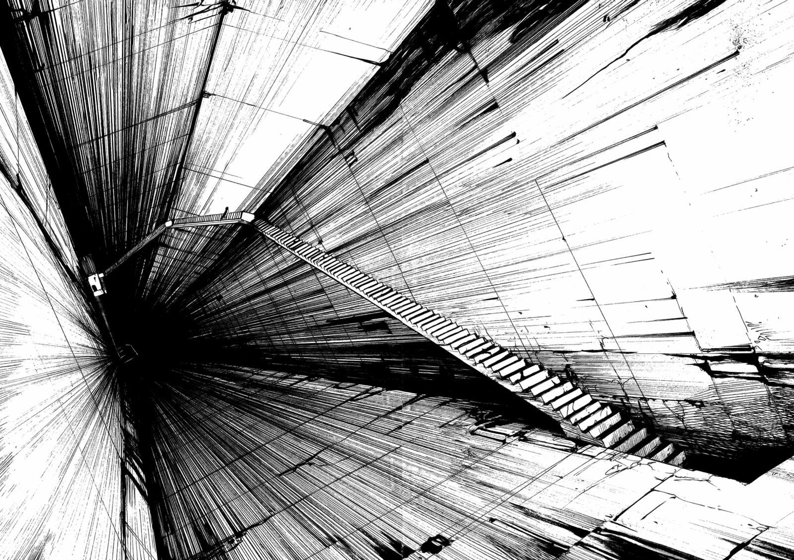
blog-contributions/assets/css/main.css
2024-05-02 09:54:49 +02:00

1143 lines
20 KiB
CSS

/*
* Author: Carlos Alvarez
* URL: http://alvarez.is
*
* Project Name: STANLEY - Free Bootstrap 3 Theme
* Version: 1.0
* URL: http://blacktie.co
*/
/*@import url(http://fonts.googleapis.com/css?family=Montserrat:400,700);*/
/*@import url(montserrat.css);*/
body {
background-color: #000000;
font-family: sans-serif;
font-weight: 400;
font-size: 14px;
color: #ffffff;
-webkit-font-smoothing: antialiased;
-webkit-overflow-scrolling: touch;
}
/* Titles */
h1, h2, h3, h4, h5, h6 {
font-family: sans-serif;
font-weight: 700;
color: #ffffff;
}
b {
background-color: #08101c;
color:#e5ae39;
padding-right:1px;
padding-left:1px;
padding-top:1px;
padding-bottom:1px;
#border: 1px dotted #ffff00;
border: 2px solid #08101c;
border-radius: 5px;
}
h1 {
font-size: 35px;
margin-top: 30px;
margin-bottom: 30px;
}
/* Paragraph & Typographic */
p {
line-height: 28px;
margin-bottom: 25px;
font-size: 16px;
}
.centered {
text-align: center;
}
/* Links */
.notorious {
color: #;
}
a {
color: #1abc9c;
word-wrap: break-word;
-webkit-transition: color 0.1s ease-in, background 0.1s ease-in;
-moz-transition: color 0.1s ease-in, background 0.1s ease-in;
-ms-transition: color 0.1s ease-in, background 0.1s ease-in;
-o-transition: color 0.1s ease-in, background 0.1s ease-in;
transition: color 0.1s ease-in, background 0.1s ease-in;
}
a:hover,
a:focus {
color: #FFFF00;
text-decoration: none;
outline: 0;
}
a:before,
a:after {
-webkit-transition: color 0.1s ease-in, background 0.1s ease-in;
-moz-transition: color 0.1s ease-in, background 0.1s ease-in;
-ms-transition: color 0.1s ease-in, background 0.1s ease-in;
-o-transition: color 0.1s ease-in, background 0.1s ease-in;
transition: color 0.1s ease-in, background 0.1s ease-in;
}
hr {
display: block;
height: 1px;
border: 0;
border-top: 1px solid #ccc;
margin: 1em 0;
padding: 0;
}
input {
background-color: #007760;
}
text{
color: #ffffff;
}
.navbar {
text-transform: uppercase;
width: 100%;
margin-bottom: 0px;
}
.navbar-inverse {
width: auto;
padding-bottom: 70px;
padding-top: 70px;
}
.navbar-inverse {
width: auto;
background-color: #001010;
border-color: #16a085;
}
.navbar-inverse .navbar-nav > li > a {
width: auto;
color: white;
}
/*medium*/
.navbar-inverse-medium .navbar-nav > li >a {
width: auto;
color: orange;
}
.navbar-inverse-medium {
width: auto;
background-color: #101000;
border-color: #ffff16;
}
.navbar-brand-med {
width: auto;
color: orange;
font-weight: 700;
font-size: 20px;
letter-spacing: 2px;
padding-left: 50px;
}
/*medium*/
/*hard*/
.navbar-inverse-hard .navbar-nav > li >a {
width: auto;
color: red;
}
.navbar-inverse-hard {
width: auto;
background-color: #100000;
border-color: #ff1616;
}
.navbar-brand-hard {
width: auto;
color: red;
font-weight: 700;
font-size: 20px;
letter-spacing: 2px;
padding-left: 50px;
}
/*hard*/
/*insane*/
.navbar-inverse-ins .navbar-nav > li >a {
width: auto;
color: grey;
}
.navbar-inverse-ins {
width: auto;
background-color: #050010;
border-color: #ffffff;
}
.navbar-brand-ins {
width: auto;
color: rgb(255, 255, 255);
font-weight: 700;
font-size: 20px;
letter-spacing: 2px;
padding-left: 50px;
}
/*insane*/
/* anon */
.navbar-inverse-anon .navbar-nav > li >a {
width: auto;
color: #9b5ce8;
/*color: #f09018;*/
}
.navbar-inverse-anon {
width: auto;
background-color: #000010;
border-color: #9b5ce8;
/*border-color: #f09018;*/
}
.navbar-brand-anon {
width: auto;
color: #9b5ce8;
/* color: #f09018;*/
font-weight: 700;
font-size: 20px;
letter-spacing: 2px;
padding-left: 50px;
}
/* anon */
/* cisco */
.navbar-inverse-cis .navbar-nav > li >a {
width: auto;
color: #5db6e9;
/*color: #f09018;*/
}
.navbar-inverse-cis {
width: auto;
background-color: #000010;
border-color: #5db6e9;
/*border-color: #f09018;*/
}
.navbar-brand-cis {
width: auto;
color: #5db6e9;
/* color: #f09018;*/
font-weight: 700;
font-size: 20px;
letter-spacing: 2px;
padding-left: 50px;
}
/* cisco */
.navbar-inverse .navbar-nav > li > a:hover {
width: auto;
color: #000000;
}
.navbar-brand {
width: auto;
font-weight: 700;
font-size: 20px;
letter-spacing: 2px;
padding-left: 50px;
}
.navbar-inverse .navbar-brand {
width: auto;
color: white;
}
.navbar-inverse .navbar-toggle {
width: auto;
border-color: transparent;
}
.progress-bar-theme {
background-color: #1abc9c;
}
/* Helpers */
.mt {
margin-top: 40px;
margin-bottom: 40px;
}
.pt {
padding-top: 50px;
padding-bottom: 50px;
}
/* +++++ WRAP SECTIONS +++++ */
#ww {
padding-top: 70px;
padding-bottom: 70px;
background-color: #003030;
}
#footer {
background-color: #001010;
padding-top: 50px;
padding-bottom: 50px;
}
#footer p {
color: white;
}
#footer h4 {
color: white;
text-transform: uppercase;
padding-bottom: 20px;
}
/* +++++ Color Wraps / Blog Page +++++ */
#grey3 {
width: 100%;
padding-top: 60px;
padding-bottom: 60px;
background-color: #003030;
}
#grey2 {
width: 100%;
padding-top: 60px;
padding-bottom: 60px;
background-color: #004040;
}
#grey1 {
width: 100%;
padding-top: 60px;
padding-bottom: 60px;
background-color: #003030;
}
#black {
width: 100%;
padding-top: 60px;
padding-bottom: 60px;
background-color: #002020;
}
#black1 {
width: 100%;
padding-top: 60px;
padding-bottom: 60px;
background-color: #001515;
}
.imgRz{
width:100%;
height:auto;
}
.nim{
background-color: #000000;
}
pre {
display: block;
font-family: monospace;
white-space: pre;
background-color: #000000;
border-color: #f09018;
margin: 1em 0;
}
#m3 {
width: 100%;
padding-top: 60px;
padding-bottom: 60px;
background-color: #202006;
}
#m2 {
width: 100%;
padding-top: 60px;
padding-bottom: 60px;
background-color: #303010;
}
#m1 {
width: 100%;
padding-top: 60px;
padding-bottom: 60px;
background-color: #202006;
}
#m0 {
width: 100%;
padding-top: 60px;
padding-bottom: 60px;
background-color: #151504;
}
#mb {
width: 100%;
padding-top: 60px;
padding-bottom: 60px;
background-color: #101003;
}
#mb p > a{
color: orange;
}
#hard3 {
width: 100%;
padding-top: 60px;
padding-bottom: 60px;
background-color: #211111;
}
#hard2 {
width: 100%;
padding-top: 60px;
padding-bottom: 60px;
background-color: #331e1e;
}
#hard1 {
width: 100%;
padding-top: 60px;
padding-bottom: 60px;
background-color: #211213;
}
#hard0 {
width: 100%;
padding-top: 60px;
padding-bottom: 60px;
background-color: #190e0f;
}
#hardb {
width: 100%;
padding-top: 60px;
padding-bottom: 60px;
background-color: #11090a;
}
#hardb p > a{
color: red;
}
#ins3 {
width: 100%;
padding-top: 60px;
padding-bottom: 60px;
background-color: #11113b;
}
#ins2 {
width: 100%;
padding-top: 60px;
padding-bottom: 60px;
background-color: #12125f;
}
#ins1 {
width: 100%;
padding-top: 60px;
padding-bottom: 60px;
background-color: #11113f;
}
#ins0 {
width: 100%;
padding-top: 60px;
padding-bottom: 60px;
background-color: #09092b;
}
#insb {
width: 100%;
padding-top: 60px;
padding-bottom: 60px;
background-color: #10101b;
}
#insb p > a{
color: rgb(90, 90, 90);
}
#anon{
width: 100%;
padding-top: 60px;
padding-bottom: 60px;
background-color: #3f2859;
/* background-color: #4f2a34;*/
}
#anon3 {
width: 100%;
padding-top: 60px;
padding-bottom: 60px;
background-color: #3f2d56;
/*background-color: #351d24; */
}
#anon2 {
width: 100%;
padding-top: 60px;
padding-bottom: 60px;
background-color: #563d77;
/*background-color: #351d24; */
}
#anon1 {
width: 100%;
padding-top: 60px;
padding-bottom: 60px;
background-color: #40315b;
/*background-color: #190e11; */
}
#anon0 {
width: 100%;
padding-top: 60px;
padding-bottom: 60px;
background-color: #171021;
/*background-color: #070405;*/
}
#anonb {
width: 100%;
padding-top: 60px;
padding-bottom: 60px;
background-color: #0d0914;
/*background-color: #030202;*/
}
#anonb p > a{
color: #f9ed02;
/* color: #f09018;*/
}
#anon3 a{
color:#f9ed02;
/* color: #f09018;*/
}
#anon2 a{
color:#f9ed02;
/* color: #f09018;*/
}
#anon1 a{
color:#f9ed02;
/* color: #f09018;*/
}
#anonb a{
color:#f9ed02;
/* color: #f09018;*/
}
#cis3 {
width: 100%;
padding-top: 60px;
padding-bottom: 60px;
background-color: #0c3d5a;
/* background-color: #4f2a34;*/
}
#cis2 {
width: 100%;
padding-top: 60px;
padding-bottom: 60px;
background-color: #0f5279;
/*background-color: #351d24; */
}
#cis1 {
width: 100%;
padding-top: 60px;
padding-bottom: 60px;
background-color: #0c3d5a;
/*background-color: #190e11; */
}
#cis0 {
width: 100%;
padding-top: 60px;
padding-bottom: 60px;
background-color: #04151f;
/*background-color: #070405;*/
}
#cisb {
width: 100%;
padding-top: 60px;
padding-bottom: 60px;
background-color: #000814;
/*background-color: #030202;*/
}
#cisb p > a{
color: #09f4d5;
/* color: #f09018;*/
}
#cis3 a{
color:#09f4d5;
/* color: #f09018;*/
}
#cis2 a{
color:#09f4d5;
/* color: #f09018;*/
}
#cis1 a{
color:#09f4d5;
/* color: #f09018;*/
}
#cisb a{
color:#09f4d5;
/* color: #f09018;*/
}
@media only screen and (max-width: 768px) {
/* For mobile phones: */
.navbar {
width: 100%;
}
.navbar-inverse {
width: 100%;
}
.navbar-inverse {
width: 100%;
}
.navbar-inverse .navbar-nav > li > a {
width: 100%;
}
.navbar-inverse .navbar-nav > li > a:hover {
width: 100%;
}
.navbar-brand {
width: auto;
}
.navbar-inverse .navbar-brand {
width: auto;
}
.navbar-inverse .navbar-toggle {
width: auto;
}
#grey3 {
width: 100%;
}
#grey2 {
width: 100%;
}
#grey1 {
width: 100%;
}
#black {
width: 100%;
}
}
/* Blog Date*/
bd {
font-size: 12px;
text-transform: uppercase;
color: #d2d2d2;
font-weight: 700;
}
/* Blog Author*/
ba {
font-size: 12px;
text-transform: uppercase;
}
/* Blog Quote */
.bq {
font-size: 22px;
padding-top: 30px;
}
/* Blog Tags */
bt {
font-size: 12px;
}
/* ================== PORTFOLIO IMAGES HOVER EFFECT ================== */
/* Effects also are controled by hover.zoom.js */
.zoom {
display:block;
position:relative;
overflow:hidden;
background:transparent url(../img/loader.gif) no-repeat center;
}
.zoomOverlay {
position:absolute;
top:0; left:0;
bottom:0; right:0;
display:none;
background-image:url(../img/zoom.png);
background-repeat:no-repeat;
background-position:center;
}
.zoom2 {
opacity: 1;
}
.zoom2:hover {
opacity: 0.5;
}
/* glyphicon Configuration */
.glyphicon {
font-size: 40px;
color: #1abc9c;
}
.prettyprint {
color: #00ff99;
background-color: #000921;
}
.prettyprint .pln {
color: inherit;
}
.prettyprint .str,
.prettyprint .lit,
.prettyprint .atv {
color: #00ff88;
}
.prettyprint .kwd {
color: #00FF77;
}
.prettyprint .com,
.prettyprint .dec {
color: #00AAFF;
font-style: italic;
}
.prettyprint .typ {
color: #FFFF00;
}
.prettyprint .pun {
color: inherit;
}
.prettyprint .opn {
color: inherit;
}
.prettyprint .clo {
color: inherit;
}
.prettyprint .tag {
color: #00F7FF;
font-weight: bold;
}
.prettyprint .atn {
color: inherit;
}
.resizz{
width: auto;
max-width: 300px
}
#loader-wrapper {
position: fixed;
top: 0;
left: 0;
width: 100%;
height: 100%;
z-index: 1000;
}
#loader {
display: block;
position: relative;
left: 50%;
top: 50%;
width: 150px;
height: 150px;
margin: -75px 0 0 -75px;
border-radius: 50%;
border: 3px solid transparent;
border-top-color: #008870;
-webkit-animation: spin 1s linear infinite; /* Chrome, Opera 15+, Safari 5+ */
animation: spin 1s linear infinite; /* Chrome, Firefox 16+, IE 10+, Opera */
z-index: 1001;
}
#loader:before {
content: "";
position: absolute;
top: 5px;
left: 5px;
right: 5px;
bottom: 5px;
border-radius: 50%;
border: 3px solid transparent;
border-top-color: #00FFA0;
-webkit-animation: spin 1s linear infinite; /* Chrome, Opera 15+, Safari 5+ */
animation: spin 1s linear infinite; /* Chrome, Firefox 16+, IE 10+, Opera */
}
#loader:after {
content: "";
position: absolute;
top: 15px;
left: 15px;
right: 15px;
bottom: 15px;
border-radius: 50%;
border: 3px solid transparent;
border-top-color: #00AA80;
-webkit-animation: spin 1s linear infinite; /* Chrome, Opera 15+, Safari 5+ */
animation: spin 1s linear infinite; /* Chrome, Firefox 16+, IE 10+, Opera */
}
@-webkit-keyframes spin {
0% {
-webkit-transform: rotate(0deg); /* Chrome, Opera 15+, Safari 3.1+ */
-ms-transform: rotate(0deg); /* IE 9 */
transform: rotate(0deg); /* Firefox 16+, IE 10+, Opera */
}
100% {
-webkit-transform: rotate(360deg); /* Chrome, Opera 15+, Safari 3.1+ */
-ms-transform: rotate(360deg); /* IE 9 */
transform: rotate(360deg); /* Firefox 16+, IE 10+, Opera */
}
}
@keyframes spin {
0% {
-webkit-transform: rotate(0deg); /* Chrome, Opera 15+, Safari 3.1+ */
-ms-transform: rotate(0deg); /* IE 9 */
transform: rotate(0deg); /* Firefox 16+, IE 10+, Opera */
}
100% {
-webkit-transform: rotate(360deg); /* Chrome, Opera 15+, Safari 3.1+ */
-ms-transform: rotate(360deg); /* IE 9 */
transform: rotate(360deg); /* Firefox 16+, IE 10+, Opera */
}
}
#loader-wrapper .loader-section {
position: fixed;
top: 0;
width: 51%;
height: 100%;
background: #001010;
z-index: 1000;
-webkit-transform: translateX(0); /* Chrome, Opera 15+, Safari 3.1+ */
-ms-transform: translateX(0); /* IE 9 */
transform: translateX(0); /* Firefox 16+, IE 10+, Opera */
}
#loader-wrapper .loader-section.section-left {
left: 0;
}
#loader-wrapper .loader-section.section-right {
right: 0;
}
/* Loaded */
.loaded #loader-wrapper .loader-section.section-left {
-webkit-transform: translateX(-100%); /* Chrome, Opera 15+, Safari 3.1+ */
-ms-transform: translateX(-100%); /* IE 9 */
transform: translateX(-100%); /* Firefox 16+, IE 10+, Opera */
-webkit-transition: all 0.3s 0.1s cubic-bezier(0.645, 0.045, 0.355, 1.000);
transition: all 0.3s 0.1s cubic-bezier(0.645, 0.045, 0.355, 1.000);
}
.loaded #loader-wrapper .loader-section.section-right {
-webkit-transform: translateX(100%); /* Chrome, Opera 15+, Safari 3.1+ */
-ms-transform: translateX(100%); /* IE 9 */
transform: translateX(100%); /* Firefox 16+, IE 10+, Opera */
-webkit-transition: all 0.3s 0.1s cubic-bezier(0.645, 0.045, 0.355, 1.000);
transition: all 0.3s 0.1s cubic-bezier(0.645, 0.045, 0.355, 1.000);
}
.loaded #loader {
opacity: 0;
-webkit-transition: all 0.1s ease-out;
transition: all 0.1s ease-out;
}
.loaded #loader-wrapper {
visibility: hidden;
-webkit-transform: translateY(-100%); /* Chrome, Opera 15+, Safari 3.1+ */
-ms-transform: translateY(-100%); /* IE 9 */
transform: translateY(-100%); /* Firefox 16+, IE 10+, Opera */
-webkit-transition: all 0.1s 0.3s ease-out;
transition: all 0.1s 0.3s ease-out;
}
/* JavaScript Turned Off */
.no-js #loader-wrapper {
display: none;
}
#content {
margin: 0 auto;
padding-bottom: 50px;
width: 80%;
max-width: 978px;
}
.boulemagique{
position: absolute;
top: calc(50% - 150px);
left: calc(50% - 150px);
width: 300px;
height: 300px;
border-radius: 50%;
box-shadow:
inset 0 0 50px #fff,
inset 20px 0 80px #f0f,
inset -20px 0 80px #0ff,
inset 20px 0 300px #f0f,
inset -20px 0 300px #0ff,
0 0 50px #fff,
-10px 0 80px #f0f,
10px 0 80px #0ff;
}
/* ==========================================================================
Helper classes
========================================================================== */
/*
* Image replacement
*/
.ir {
background-color: transparent;
border: 0;
overflow: hidden;
/* IE 6/7 fallback */
*text-indent: -9999px;
}
.ir:before {
content: "";
display: block;
width: 0;
height: 150%;
}
/*
* Hide from both screenreaders and browsers: h5bp.com/u
*/
.hidden {
display: none !important;
visibility: hidden;
}
/*
* Hide only visually, but have it available for screenreaders: h5bp.com/v
*/
.visuallyhidden {
border: 0;
clip: rect(0 0 0 0);
height: 1px;
margin: -1px;
overflow: hidden;
padding: 0;
position: absolute;
width: 1px;
}
/*
* Extends the .visuallyhidden class to allow the element to be focusable
* when navigated to via the keyboard: h5bp.com/p
*/
.visuallyhidden.focusable:active,
.visuallyhidden.focusable:focus {
clip: auto;
height: auto;
margin: 0;
overflow: visible;
position: static;
width: auto;
}
/*
* Hide visually and from screenreaders, but maintain layout
*/
.invisible {
visibility: hidden;
}
/*
* Clearfix: contain floats
*
* For modern browsers
* 1. The space content is one way to avoid an Opera bug when the
* `contenteditable` attribute is included anywhere else in the document.
* Otherwise it causes space to appear at the top and bottom of elements
* that receive the `clearfix` class.
* 2. The use of `table` rather than `block` is only necessary if using
* `:before` to contain the top-margins of child elements.
*/
.clearfix:before,
.clearfix:after {
content: " "; /* 1 */
display: table; /* 2 */
}
.clearfix:after {
clear: both;
}
/*
* For IE 6/7 only
* Include this rule to trigger hasLayout and contain floats.
*/
.clearfix {
*zoom: 1;
}
/* ==========================================================================
EXAMPLE Media Queries for Responsive Design.
These examples override the primary ('mobile first') styles.
Modify as content requires.
========================================================================== */
@media only screen and (min-width: 35em) {
/* Style adjustments for viewports that meet the condition */
}
@media print,
(-o-min-device-pixel-ratio: 5/4),
(-webkit-min-device-pixel-ratio: 1.25),
(min-resolution: 120dpi) {
/* Style adjustments for high resolution devices */
}
/* ==========================================================================
Print styles.
Inlined to avoid required HTTP connection: h5bp.com/r
========================================================================== */
@media print {
* {
background: transparent !important;
color: #000 !important; /* Black prints faster: h5bp.com/s */
box-shadow: none !important;
text-shadow: none !important;
}
a,
a:visited {
text-decoration: underline;
}
a[href]:after {
content: " (" attr(href) ")";
}
abbr[title]:after {
content: " (" attr(title) ")";
}
/*
* Don't show links for images, or javascript/internal links
*/
.ir a:after,
a[href^="javascript:"]:after,
a[href^="#"]:after {
content: "";
}
pre,
blockquote {
border: 1px solid #999;
page-break-inside: auto;
}
thead {
display: table-header-group; /* h5bp.com/t */
}
tr,
img {
page-break-inside: avoid;
}
img {
max-width: 100% !important;
}
@page {
margin: 0.5cm;
}
p,
h2,
h3 {
orphans: 3;
widows: 3;
}
h2,
h3 {
page-break-after: avoid;
}
}